Mastering Printing
Learning from the masters.


I'm calling us all out... me, you, photographers in general. We all tend to be so immersed in the new world of instant imagery, overly post-processed images, HDR-y images that have sacrificed dynamic tonality on the alter of Instagram likes, so much so that many of us have forgotten what actually makes a good print.
Obviously we address critical and subtle elements of fine art printing here every week. But if you'd like to delve into the details of fine art printing in one place, you'd do well to download my free eBook on fine art printing. But there is one aspect of printing that gets short shrift. That is the legacy that the Masters of Photography have left us, contributions that can radically improve our entire approach to printing, and photography in general.
I'm not at all against the continued evolution of photography. In many ways it has been a good thing in that it has brought millions/billions of humanity to appreciate the art of photography. But I think it's time for those of us who value printing to take a deep breath and revisit the pioneering work of the Masters, both past and current.
On November 2 and 3 I'll be making two presentations at the Mid-Atlantic Photo Visions conference (MAPV) in Manassas, Virginia. One of my presentations will be on "What We Can Learn From the Masters" and the other is on "Fine Art Printing". The two are intricately linked, at least in my mind.
From the very beginnings of photography The Print has been the yardstick that we use to evaluate one's work. Today we have moved far from that measurement tool. But we fortunately still have preserved the legacy of these pioneering men and women in their books and surviving prints.
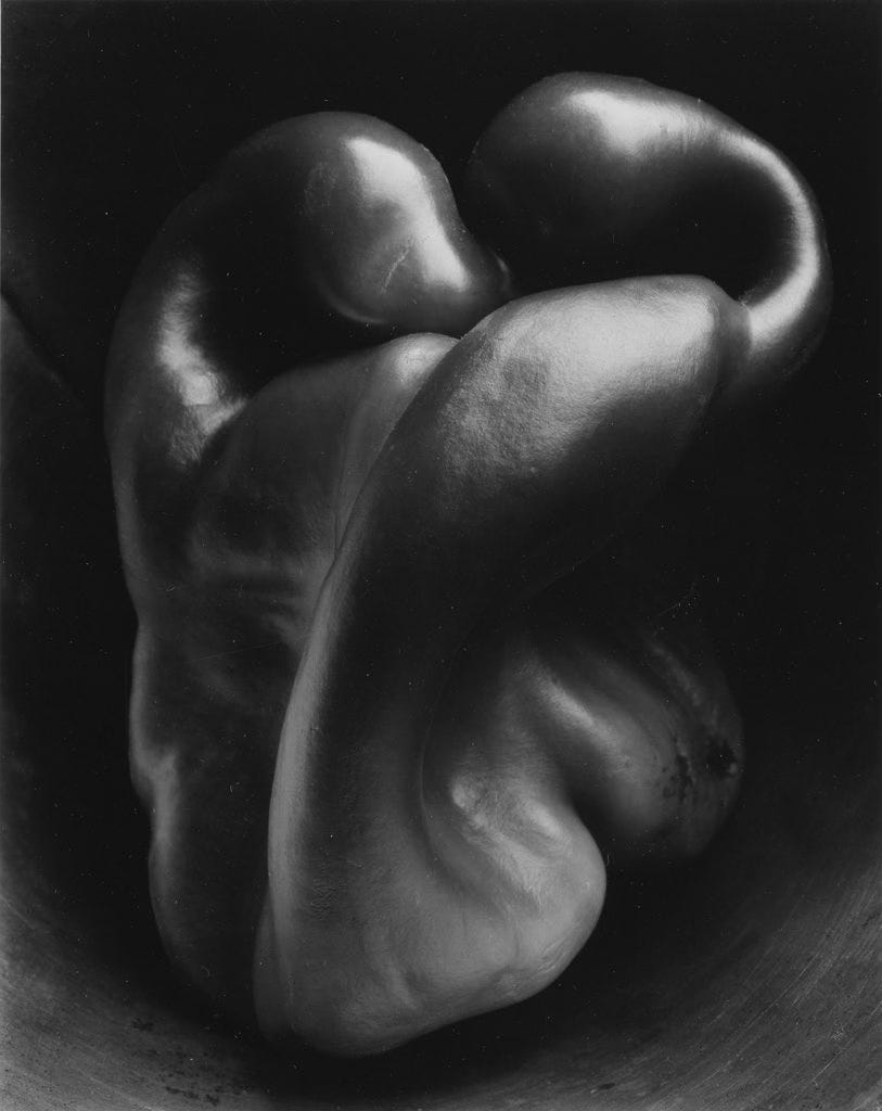
The point here is that I strongly recommend you pick up the works of photographic legends like Sabastiao Salgado, Dorothea Lange, Edward Westin, Patrick Demarchelier, Ansel Adams and others (the list is long but there's a great used book market out there!). Spend time with them. Pay attention to details. See how they handled the subtle tones in the scene. How might their work influence your decision-making out in the field? Does it make you rethink your post-processing?
Also, visit galleries and museums to see what photo printing excellence is like. But, even fine art painters have much to teach us about light and shadow, as I've written about before. As far as photo prints go, why did the artist choose a particular paper for an image? Does the framing presentation add to the impact? Did you learn anything that you'd like to put to good effect in your own work?
If you attend the MAPV conference in November, please stop by and say hello. I look forward to meeting up with our Substack followers.
Agree with everything you say here. At the recent Vivian Maier exhibition at Fotographiska they had some comparisons between her contemporary prints and modern prints of the same photo: the difference was significant, and a great example of the level of quality modern silver prints can achieve. Granted, when she printed she may not have had access to the best equipment or materials, but my point is even traditional silver prints when printed well exhibit a luminance and subtlety that is just lost on screen (and the same with inkjet).
Thanks for letting me know. Glad to help out.