Pictures Of Prints, Diagnosing Non-Problems, Etc.
Taste vs. accuracy and other matters.


A member of our community (and former Intro To Fine Art Printing workshop participant) reached out to us last week asking for help diagnosing a problem with a new printer and the results produced that didn’t match what were expected. A quick discussion revealed the problem wasn’t something egregious like an obvious color cast. Nor was it an obvious work-flow error. So what was the problem? It was the absolute worst problem that can possibly be. This is the sort of problem that gives me nightmares at night. No, it doesn't give me nightmares that I’ll experience it. It gives me nightmares when I have to attempt to diagnose it.
So what’s this nightmare of a problem? It’s a problem that has no practical deterministic answer. It’s more of a qualitative problem than a quantitative problem with no practical way of being absolutely sure of the answer. The problem was not a comparison of known previous results differing from current results, instead the problem was a particular image printed on a new printer, on a new paper, did not “match” a print that was printed by a service provider on a different printer on a different paper with an unknown set of conditions. Oh, the biggest problem is that they preferred the old print that was out-sourced better than the new prints they were producing with the new printer on the new printer with a technically correct workflow and no obvious “problems”.


Oh boy. What does one do with that? Well, after a bit of discussion and back and forth emails the best I could offer was an opinion based on the following questions and data that could be supplied given I didn’t have access to the actual prints or print environments in question.
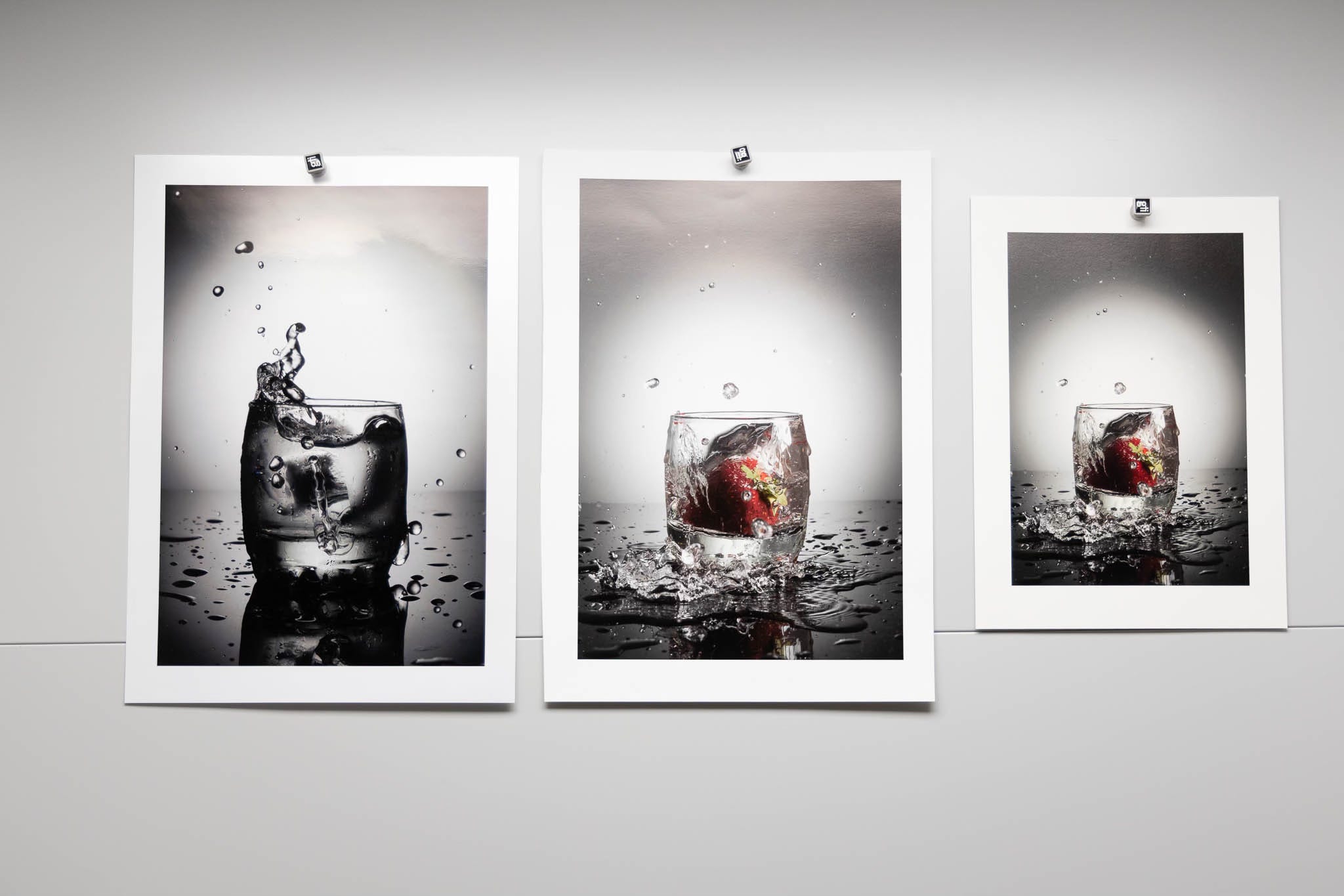
A picture of the out-sourced print.
A picture of the new print from the new printer on the new paper
A reasonable assurance the two pictures made were same exposure, same WB, under reasonably even full-spectrum lighting (similar to the picture of prints at the top)
A copy of the file that was sent to the out-sourced print service
An assurance that it was the same file being printed on the new printer/paper in-house
The mathematician/physicist/problem-solver in me knows all of the problems trying to give a good answer of “why the two prints are different”. Of course the question wouldn’t be asked if the new prints were preferred over the old out-sourced print. Those sorts of things bother me no matter which print I like better. For regular people it’s a really big problem if they like the previous print better than the new print better. Note; I stated at the beginning there were no obvious glaring flaws with the new print. More important note; There was zero discussion on which print was more accurate in terms of representing the actual image file.
The Answer?
I’ll give the short answer right here. The short answer is the absolute necessity of establishing a known baseline with reasonable reproducibility that you control as a basis of comparison rather than a fuzzy “I like this print better” criteria. Way back two years ago I wrote a basic post with advice for those people just getting into making prints. I urge new subscribers to review “Managing Your Print Environment”. This is the answer. Technically there is no answer without a lot more data to that original question posed, at least not a definitive, quantitative answer. Of course there is an opinion and a speculation based on my own experience.
I’ll ask a question to all of you based on the illustrations above. Given the files and the pictures of prints made from those files on three different papers, are those the results you’d expect? Which print do you “like better” of the one picture on two different papers? Here would be my evaluation if asked:
As far as I can tell the results are well within expectations given I cannot see the prints in person while looking at the files on a well calibrated decent monitor.
I would probably asked if those areas at the top of the two larger prints are actually in the print (a problem) or an artifact of the picture taken of the print (due to lighting, lighting angle etc.)
I can clearly see the base color of the paper on the right (smaller print) is relatively warmer than the other two larger prints and the left most print the coolest base color (probably due to OBA’s)
I might even ask if the image on the left is black and white (as there seems to be a hint of non-neutral color in it. (It’s actually a color image) in which case I wouldn’t see any sort of “problem” as it’s extremely difficult to get anything that neutral shooting color in a non-lab setting.
How About That Reader’s Problem?
The pictures of prints sent to me and the file that was used for printing the two prints in question were nowhere near as close as what I’ve provided as an example in this post. When looking at them on my 10-bit 32” monitor together I immediately saw a huge difference. Given the picture of the two prints vs the original file I saw that the print produced in-house on the new printer/paper was very close to the colors and contrast of the original file. It’s exactly what I would expect and about as close as the demonstration I provided in this newsletter.
The picture of the print that was outsourced, the one that was preferred, looked wildly different and I would not expect the file would produce that print. What was different?
A lot more contrast in the shadows and mid-tones
The colors were more saturated (partially due to the bump in contrast)
The shadows were a lot less open (less detailed)
Hues were shifted, especially in the reds, far more than the difference in the examples included.
Could the differences I am seeing be the result of the paper and printing process used? Possibly but doubtful. In fact the results produced by the out-sourced printing would look like either a wildly “bad” profile or more likely some degree of post-processing on the original file before being printed. The bottom line is that the new printer/paper looks more “accurate” a rendition than the out-sourced print.
Let’s pretend that the variation in prints is entirely due to the printer and paper used by the outsourced print. How would I know? How could I tell? Well the first thing I would need is the profile they are using to print, at least I could see the color differences or be warned about them via soft-proofing. I really couldn’t tell much about the DMAX (black levels) on the print without viewing both in person as they are difficult to see accurately in a picture of a print. How about contrast in the print
? That would be similarly difficult to see in a picture of a print. So why am I fairly confident in my assessment? The answer is entirely experience based with similar papers on similar printers looking at files to be printed.
Without a very detailed question and answer session with the out-sourced service I could not answer why the prints are as different as they are. My only conclusion has to be a difference in post-processing given my experience with all sorts of ink-jet printers, CMYK printing using out-sourced prints, as well as C-prints (photographic paper prints).
The bottom line is “accurate” results don’t at all lead to preferred results. Accurate results are all about predictability of output when printing. Maintaining a verifiable baseline and experience producing prints is the basis for comparing printers, papers, and a reasonable idea of what a print will look like on a decent monitor. I’ve not delivered my assessment to our fellow reader yet but the gist of it is contained in this newsletter. I plan on discussing the more specific elements with him this week, with his permission I’ll follow up with a resolution and any additional thoughts that might be helpful to the rest of our community. Maybe even the files I was evaluating remotely?
.. please don’t hate me .. but there’s a certain - almost incremental ‘Kentucky windage.. aspect to ‘Reproduction .. Tonal Bullseye .. in my ‘perspective ..
- aside from early darkroom B & W dayz & little $ - my ‘Grail was Kodachrome Transparency (when i could afford ‘PrePaid Development & Mail Back) - this was until Clients began ‘getting it.. & expected it in my Quotes etc & most of them ‘got it’ because we were printing CibaChrome for most clients.. so What I Shot was ‘right there !’ -> Prints Should Match.. or salvage my raggedy ass exposures !
Despite being a renegade shooter myself - I love how you ‘work to Benchmarks ..(Best Practices) Whenever possible..
- on Assignment - don’t imagine I didn’t at least attempt - in every scenario I shot - to Bracket with Colour Chart & Gray Scale card .. holy hell .. Did so working in 4x5 too ..
- Shooting Archival for Artist, Sculptors, Designers - i soon learned - whether Show Sale Portfolio Submissions & media etc requires little ‘creativity - mucho informed ‘discipline .. is all ! 🦎🏴☠️🍁
There are so many things to be considered here. Source Profiles, Output Profiles, media profiles, simulations on/off, black point, white point, etc. It would be next to impossible to figure out the issue(s) without being on-site.