Arches BFK Rives
A tale of two subtly differentiated papers


Canson Arches BFK Rives is produced in two varieties, white and pure white. The names of these two papers without mentioning the Canson part are already a mouthful. Imagine if the BFK part wasn’t abbreviated. I assume BFK is an abbreviation. I don’t know what BFK means. I’ll investigate as my curiosity is now tweaked. Doesn’t matter, let’s get to the important part…
White, Whiter, & Whitest-est

I have no idea why one version has the moniker white. As far as I can tell, this is the same paper previously known as BFK Rives period, without the white added on to the end. I have a sample pack. No, the word period is not in the name. I’m dwelling on this apparently minor point for a couple of reasons. The entire Arches line of papers are very white. So much so that at first glance, I thought they had some degree of optical brightening agents (OBAs). I mentioned this a few weeks ago.
Another reason I dwell on that word white used as a differentiator is that BFK Rives White turns out to be the least white, warmest paper in the Arches line. It’s warmer than the ’88’, it’s warmer than the Aquarelle, and it is certainly warmer than its fraternal twin BFK Rives Pure White. So what you have with these two nearly identical papers, both very white, considering they have no OBAs, are papers that bracket the Arches very white family as the whitest and the warmest.
Texture
When taking a look at the Arches line of papers, I decided to asses the most textured to the least textured in the family. Aquarelle is the most textured. I contrasted that paper with other highly textured papers as a reference for readers that might be familiar with the Moab Entrada Coldpress or the Hahnemühle Museum Etching.
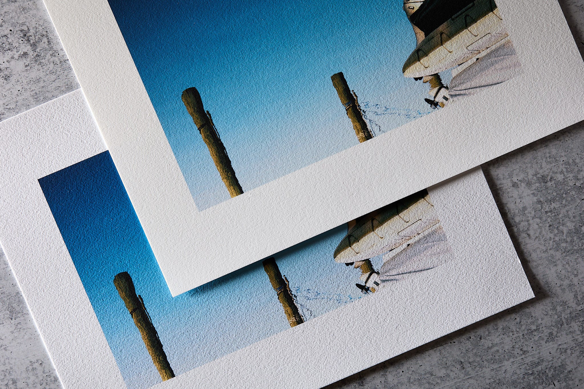
Both BFK Rives papers are not quite as textured as any of those referenced above. Both are quite clearly textured but definitely more subtle. At first look, there was something that reminded me of a paper I love, Hahnemühle Torchon, but consider extremely textured and therefore a little bit more specialized than smoother papers like Moab Entrada. I decided to compare the BFK Rives papers to Aquarelle and, of all things, Hahnemühle Torchon.
Textured needs to be defined with more clarity. What exactly does more textured vs. less textured mean precisely? It’s obvious when comparing papers that are miles apart in terms of any apparent texture. An example would be comparing Moab Entrada Natural with Natural Coldpress. Using a phrase like more textured is quite obvious. It’s not that Natural has zero texture; it’s just very fine and very shallow. It doesn’t impose itself on the applied image in a way that is obvious like Coldpress does.
When evaluating papers that are obviously textured, it’s useful to compare texture in two different dimensions that I’ll term width and depth. The width dimension is how wide the textured pattern is. Depth, again by its very name, is how deep from the surface the textured pattern is. One more consideration that determines the overall look of textured papers is the ratio of those two factors. I’m not going to attempt to math this to death, but that depth ratio plays a huge role in the contrast and therefore perception of the texture.
A paper with a very fine texture in terms of the width of its pattern but being relatively deep will be contrasty and rough in appearance. It will impose that texture upon a printed image in a significant way. Keeping that same depth, or even more depth with a very wide pattern will be softer in appearance. This is why Hahnemühle Torchon came to mind when I examined the BFK Rives twins. The Torchon has a ludicrously wider texture, but that texture is so wide it doesn’t have deep shadows that call itself out prominently.

The BFK Rives papers are similar in that way. The width of the texture is much finer but doesn’t have enough depth to be as prominent as the Aquarelle. It’s probably more versatile and easier to pair with a wider array of photographs because the texture doesn’t demand attention.
Pairing photographs
I dove into the notions of width, depth, the ratio of the two, and how those things affect perception of paper textures because it’s super important when mating photographs to the perfect paper. Matt papers offer a huge diversity of surface textures. That’s what is great about them. So many of those obviously textured papers are drop-dead gorgeous. I tremble with fear and reverence when I hit that print button, hoping to make a beautiful object, hoping I am not ruining the pristine material. I typically don’t feel that way with a plastic-looking bright white semi-gloss run-of-the-mill all-purpose photo paper that looks a lot like the stuff you get from Walmart prints.
The more apparent the texture, the more important it is to consider how that texture interacts and imposes itself on a printed photograph. What might not be so obvious is that the texture is of a constant size no matter what size the print is. The detail in the photograph does change in size depending on the size one prints. This can be amazingly important when selecting a paper.
Printing a 7in x 10.5in picture on 11in x 14in paper can look vastly different in terms of how paper texture interacts with the detail than the same picture printed much larger or much smaller. Do yourself a favor, print a proof with the photo at the same scale for your final print. It’s super easy to do with Photoshop.
Load up your picture in Photoshop
Go to Image->Image Size
Uncheck resample
Set your image dimensions to the target print size in in/cm
Go to File->Print
Select a much smaller size paper.
Drag the image around in the preview to print an area of representative detail at the full scale of the target print on the smaller paper.
Color, blacks, etc.
This one is easy. I’m not going to spend a whole lot of time because there are no significant differences in gamut, dmax, or other characteristics that are worth pointing out. Both papers have more than adequate characteristics compared to peer matt papers. They will both perform extremely well with color and black and white photographs, leaving little to yearn for. I’d not at all consider either of these “softer” papers in terms of toning down an image color or contrast. There are other papers that will do that. The BFK Rives are definitely more in the category of highly performing matt papers.
The defining characteristic of BFK Rives White is that it is the warmest paper in the Canson Arches line. It is subtly textured but definitely something you cannot consider smooth. The texture is subtle enough that I don’t think there is a large risk of that interfering or clashing with most photographs. Being the warmest paper in the Arches line-up, it’s still very much on the white side of non-OBA papers, so it gives a clean appearance.
Moving on to the Pure White brother. This is definitely the whitest, brightest of the Arches papers. That’s saying something significant since all of them being natural cotton rag bases are very white as the numbers bear out. If you want subtle texture that imparts an obvious fine art feel while having a “poppy” look approaching papers with OBAs, this is the paper for you. Super impressive for a portfolio in my opinion.
Note: In the illustration comparing Torchon with both Rives BFK papers, the Torchon is on top RIGHT, not left as in the original newsletter sent out.
I got sample packs of BFK Rives Pure White and Arches 88 last week and was super impressed. One of my good friends prints only monochrome and has been using BFK Pure White to amazing effect. He had a gallery showing in February in DC of 'Resistance Photographs' he took during various periods last year. I especially liked the Arches 88 as I started printing some years ago on Museo Portfolio Rag (it is too bad that the company lost its way and ended up being subsumed by Hahnemuhle a while back; I still have a box of Artists Cards that I am slowly using up). I like smooth surface matte papers and it's good to have another one to choose from.
My go to matte paper has been Moab Entrada. I will still use it but believe the two Arches papers may displace it. The texture of the BFK Rives is not obtrusive which is good. I'm just waiting for a couple of boxes of them so I can do the profiling for my printer. I'm looking forward to your comments on Arches 88. I need to keep my choice of papers down to a manageable few.😁