

Recently, photographers who have an Adobe subscription of various types, including the lowly Photography Plan, have received a few new goodies from the unending, constant updates. I’m specifically referring to Generative Expand for the crop/rotate tool/geometry tool and the new Glow section in the effects tool. I’m not going to go into a lot of detail about either of these new goodies. If you’re not already familiar with them, go take a look at a few helpful introductions.
Camera RAW effects Generative Expand
This is the first time in a long time, if ever, I can remember that Adobe has released fairly significant new capabilities into Adobe Camera RAW, aka ACR, that is the base code for all of Adobe’s RAW image processing capabilities that are not included in the Lightroom Classic Development Module. Maybe some of you might be able to list a few, but I’ll bet they are not ACR base features. In fact, it has been the reverse for a very long time. For example, Lightroom Classic has the print module. There is no such thing in Lightroom CC or mobile or whatever the proper designation is; Lightroom, not classic if you will.
When I see things like this, it’s very unsettling to me. Maybe it’s just a delay? Maybe the Classic time is old and tired? Maybe Adobe just wants to see if anyone notices??? I’ve been around long enough to at least suspect this is a small but forceful nudge, pushing everyone into the Adobe Cloud storage platform. I hope not, but I wouldn’t be surprised if we see more and more of this feature non-parity. Please let Adobe know how displeased you are if you’re a Lightroom Classic user.
Moving on, about these new tools…
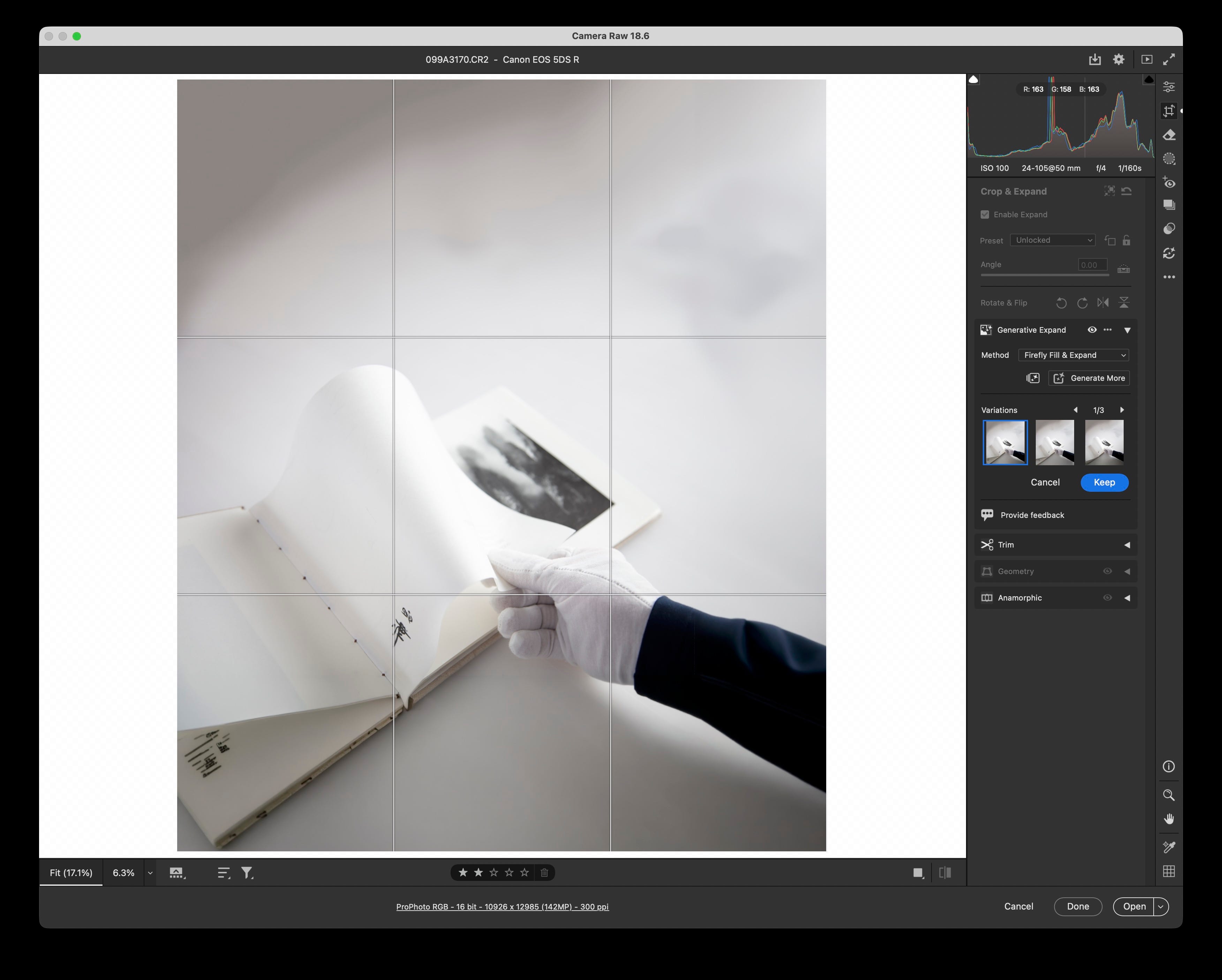
Let’s start with the one that probably has too many people, too excited, Generative Expand. I’ve played with it a little. I’m not an expert but know enough to test “easy” cases and “this will be a horror show” cases. What did I learn through a few tests? The answer is unsurprisingly that it behaved exactly how I expected it to.
The simple case at the top of the post I expanded both the top and bottom of this original landscape-oriented image. The top was easy and the free “content-aware” option did an okay job. The pay-as-you-go “firefly AI generative” performed similarly. The bottom of the image was a disaster using “content-aware” and did way better but still a tiny bit of uncanny valley with manufacturing a forearm. Little bit of anatomical bizarr-ity but at least it kinda knew it was an arm.
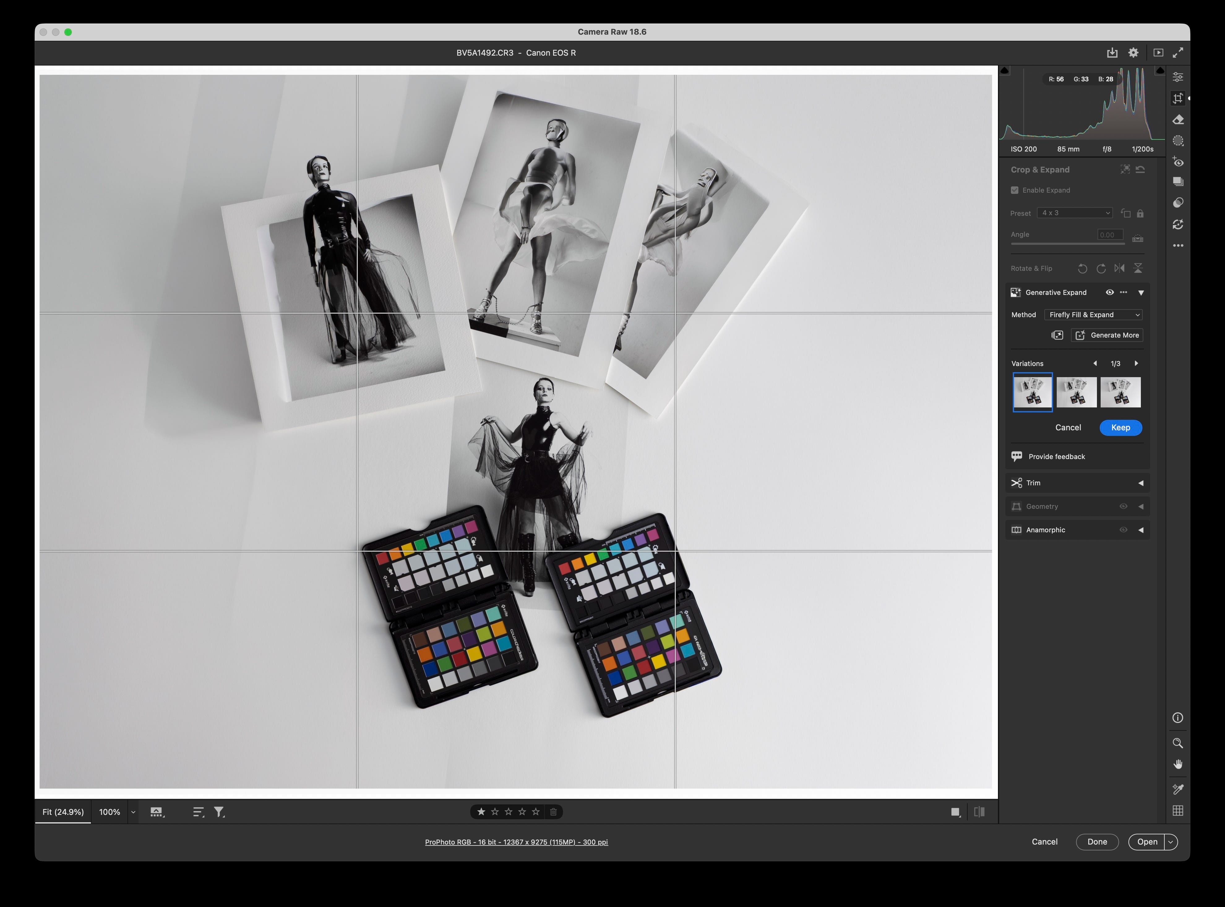
How did it do on full blast “Firefly Generative AI” manufacturing prints of people with various pieces cut off? You tell me? I immediately cancelled saving that new edit in ACR as I think it might cause me nightmares down the road if I forgot it was testing the “expand” functionality. It obviously has no idea what a color checker looks like either.
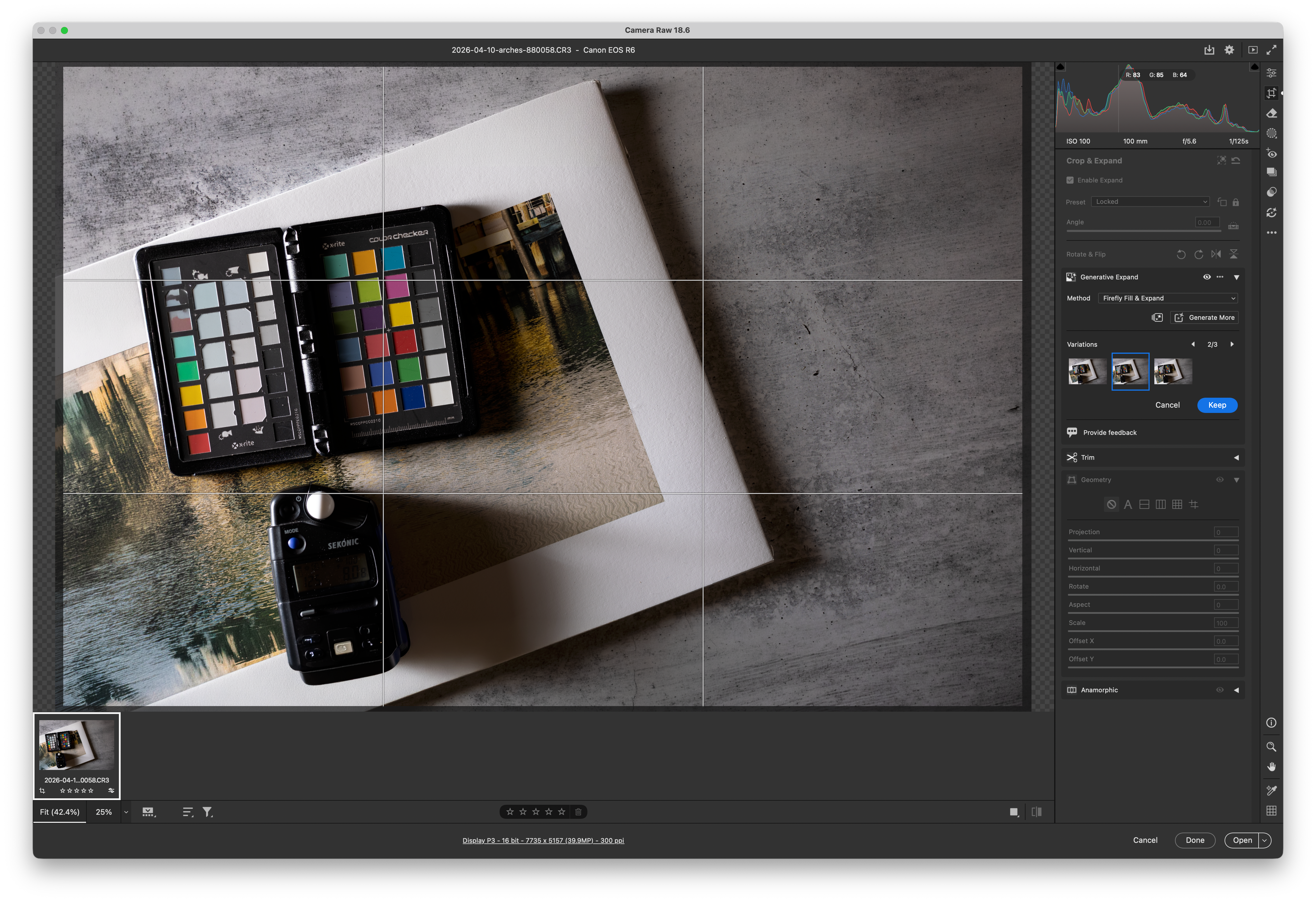
How about a middle of the road where I had no clue what it would do image... well, I’d say that lands square inside uncanny valley. Yes, I used the least disturbing version of what it produced but still…
Is it cool? Maybe? There’s a reason I am tempering people’s excitement about it. Please don’t comment on how much better AI is going to get. I don’t care, and it’s not really what this tool is for. Instead of being something for generating complex content for things that don’t exist, I can be a real-time saver for commercial types of work and image purposing in specific scenarios but only if you take the final presentation into account prior to making the image. Typical when you are making pictures for a specific purpose.
This will make short work of typical scenarios of a very specific individual in a specific context and then after the fact expanding a tighter shot into a much wider shot with nobody, and no distractions in the scene. Let’s take a cliché example we’ve seen a hundred times. Beautiful woman sitting on the edge of a pool with a pristine summer sky behind and bold blue pool water in the foreground. Make that shot but in a crowded pool. Now expand the living crap out of it up, sideways, and down. No set costs and a ton of time spent on clever and error-prone cloning, etc.
Another thought; Most people will want to do this after the fact. Take a wide shot, crop it, then expand it. I am sure you can jump through the hoops of maybe doing this, but that’s not at all how the interface is designed, and I’d suggest it probably doesn’t do that well in reverse like I would see most people (based on how heavily I see people crop). If it does work well, I’ll bet that’s the exception.
The last thing to consider is the money-grab aspect. I really don’t like that this is pay-as-you-go and the cost and how much you are using are not right up in your face as you click the button. Also realize that this needs to be re-done like most AI-related features after many adjustments. Is there a cost? Will there be? How about “upgrading your processing version”? Hmmm… There are a ton of other concerns I have, but that’s a philosophical discussion for another day. Bottom line, things turn out better if you have your intent from the very start. Use the tool but realize that when you make the picture in the first place. Post-processing is not a rescue tool, or it shouldn’t be as a matter of workflow.
Oh yeah, there’s the glow thing…
I’ll bet you think I’m about to dump all over this, right? Well, I’m not. It’s cool, it seems well done for the little bit of experiments I’ve done with it. Will I plaster it all over every photo? Nope. I did joke with Les that we’re going to see a heck of a lot of work with this new tool overdone in the next two years. In fact, I’ll jokingly call it “The return of Glamor Glow”. An effect that was like crack for a few years when the OG Nik effects came out.
It’s not the return of Glamor Glow. It does a decent job of things I do all the time and have since I was shooting film. I regularly shoot with old crappy lenses, crappy in the sense that they are sharp but produce these effects on highlights to varying degrees. I bought a camera not too long ago that has a dedicated HDF filter to do exactly this. I also regularly mess with the color of that diffusion (sometimes via WB, sometimes it’s built into the lens). This just extends my options to match up different cameras and lenses to that look in the same project. Hats off to Adobe, good job. Now let’s get some much-needed attention to the grain effect… Hmmm...
Until next time, thank you to all our paid subscribers helping us to keep the lights on. Have a great week, make the most of these amazing days before winter sets in, and please get outside to enjoy the fall transition if you’re in the Northern Hemisphere.
I’m ruefully laughing because I’m engaged in a fight with my printer/photoshop while using the same tools you just wrote about. I decided to go full Rothko on a perfectly good photo of a small boat floating in a nearby lake - one of those days when the lake reflected the sky and clouds so perfectly that it looks like the little boat is floating in infinity. But noooo. I decided I had to add several inches to the bottom of the image, so the water falls away in a smooth blue gradation down to dark. I wanted a blue you could fall into. I first tried “match” the water colors at the bottom of the image with the new gradation tool. Not good. Legacy gradation next. Better, but not quite. Adjustment tools. No. Several different Firefly editions to extend the image, delivered, not quite right, to hilarious ai interpretations of what might be hiding at the bottom of a body of water. The closest possibilities look pretty good on my screen - but in print they all have a subtle layer of gray going across the print around the middle of the gradation. I think it’s ai or content aware adaptation of grayish cloud-mist edges reconstituted in a 2” band of gray blue instead of simply fading out. It’s turned into the battle of the gray band. There’s nothing wrong with the original picture. But it’s me against photoshop now, and I don’t want to lose a battle with my tools! I would have at it again today, but I have a Thursday deadline for other stuff, so I’ll leave it alone for a while.