

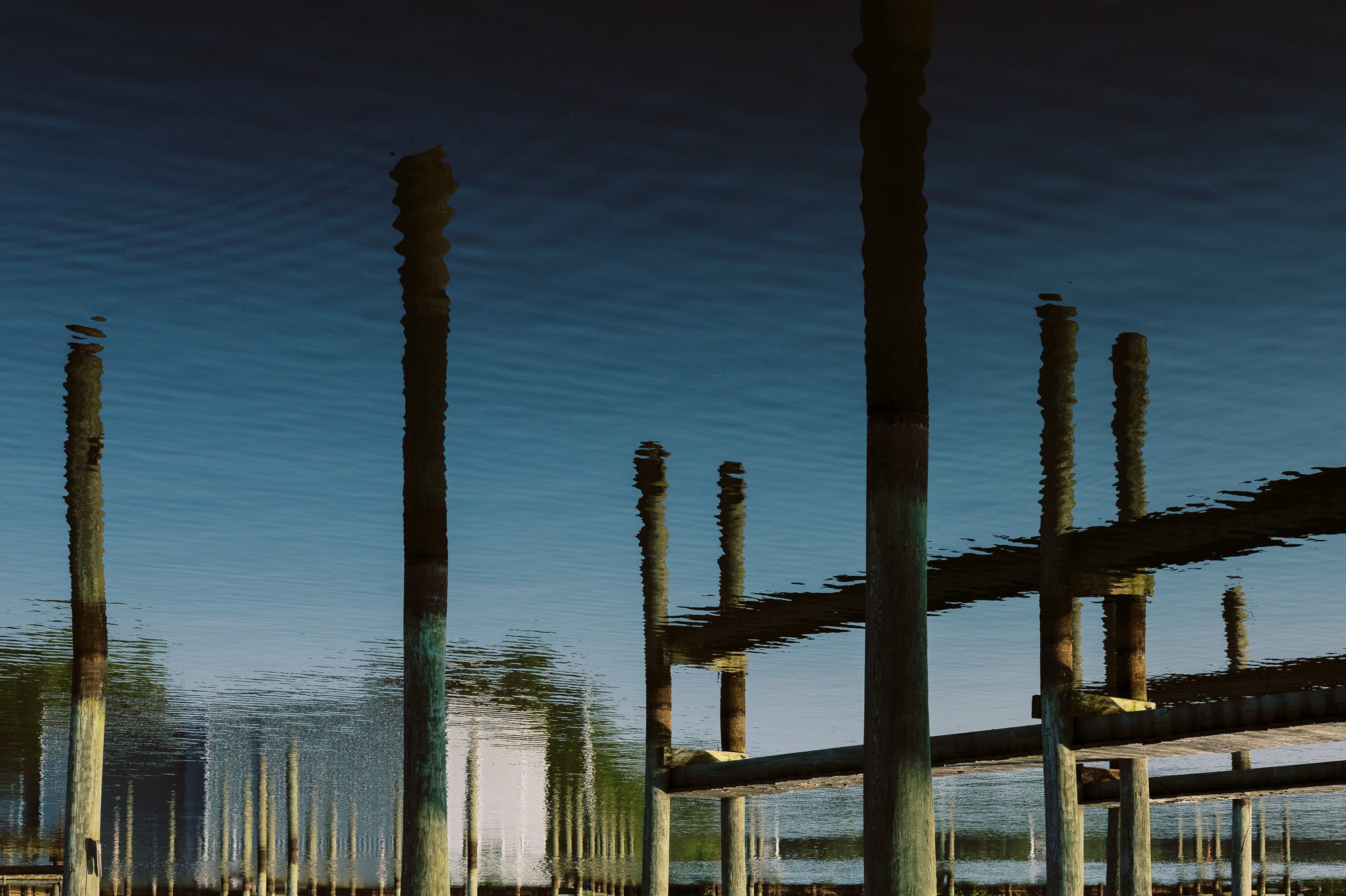
I’ve briefly discussed a couple of personal projects on the newsletter before. Watercolors: Subversions is the working title for a project that grew naturally out of my Watercolors project. At first, I thought they were the same project, but I was quite wrong as I finished the original project. The photographs that started me on the road were rejects from the original project. Not all of those rejects stayed in the new endeavor.
I thought I was done months and months ago. I was wrong. As I approached, and even insisted the final number of 10 prints was my constraining factor, I found that constraint was not serving me well. I opened my editorial process back up, not starting from scratch but rather I reexamined two rounds of “rejects” to each other. I did this knowing that those “10” were definitely to be included. Knowing what was in allowed me to look at both sets again in a new light. Those rejects that were mere duplicates, or practical duplicates, were now very apparent.
The big deal was removing that maximum number and really, seriously, which of those rejects would contribute to the project in a significant way. Which ones would add balance and add coherence visually when viewed together? The two I’ve included in this post are very much compositional connective tissue to other images in that original hard “10”. They are both similarly connective tissue in terms of color palette to images that seemed a bit lonely in my original selection.
The funny part is I originally rejected them both not because I didn’t like them but I viewed them in terms of being too repetitive. This was only due to similar subject matter - literally. The intent with my hard-line “10” as maximum was to focus on diversity of literal subject matter and visual similarities.
Easing off that hard-line number completely changed my view. I am looking at the project very differently. I don’t have one editorial slice but multiple, depending on how many images I have space to show them and what feel I’d like to portray. I could maximize diversity in smaller subsets or double down on extremely consistent subject matter. I can harmonize color palettes or contrast them. I’ll probably codify those collection subsets so I remember them. This is exactly what you need to do anyway if you were doing something as large as a book. You’ll always need subsets to show to various audiences in various venues.
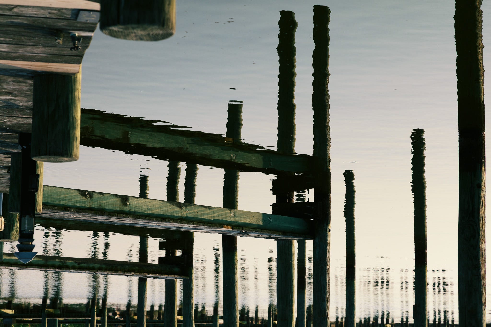
The other hold up is sort of an editorial decision that manifests itself as an editorial decision. My own particular photographic taste is almost puritanical. I almost never reach for the clone or healing brush, let alone that new really slow generative AI brush. In other words, if it was in the picture, it stays in the picture. Here’s the rub…
I plan on the vast majority of prints to be shown in small-ish sizes, which presents an issue. Those prints sometimes render debris floating in the water as print flaws. If they are super bright, they look like the ink flaked off. If they are super dark, they look like a print-head strike or a blob of ink from a printer issue. What to do? What to do? Do I sacrifice my photographic integrity to the false pursuit of artifice of some committee version of “perfect” or do I say “don’t care, let them eat cake”?
I decided on a middle road. My intent was to leave that floating debris as reality anchors in sharp contrast to the dreaminess of the overall abstract effect. I did just that except for those that really looked like print flaws on close inspection of an 11x14 print or smaller. I did not go hog wild eliminating every piece of floating debris just because I “could” or serving some unknown photo-perfect-thru-tech-capabilities committee that wouldn’t be my audience anyway.
Am I done now? I think so, but there’s one more thing, a surprise to me, a complete surprise at that. It’s a subset of this project I never saw coming, a happy accident. I’ll share that soon. Thank you to all of our generous paid subscribers that help us keep the lights on.
Were they actually originally rejected because they were upside down? 🙂
It worries me a little every time I agree with you Bob, but here I go again. I know people who think if you don’t spend two hours editing an image then you just don’t care or you don’t know what you’re doing. Their images look so perfect they’re kinda boring. I’m not sure puritanical is the right word for it but I personally like photos that look real and just a little imperfect. One thing I know about your editing Bob, you do know what you’re doing. Good post. Thanks.