

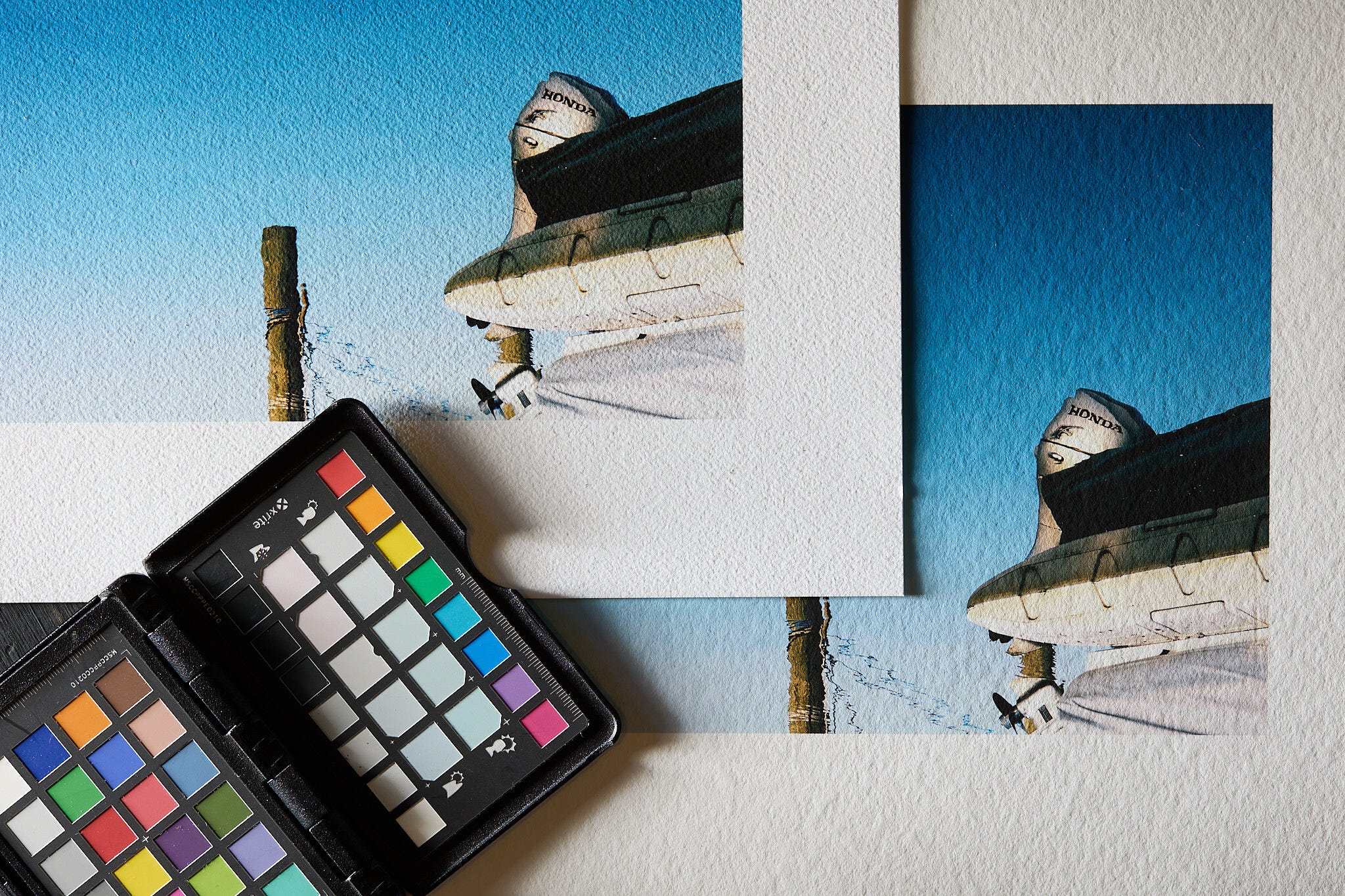
Over the course of the last year, I spent a lot of time discussing my Watercolors:Subversion project. I’ve used this particular project to walk through many of my discussions of various paper choices I’ve evaluated to ultimately print the final version. I thought using a consistent set of images might be helpful to readers in their own projects. You already know that I chose Canson Arches 88 as the paper that suited the work and my vision. Today, I wanted to refine my thoughts on that choice and some overall tips about matte papers in general.
A quick rewind first; Les and I recommend choosing a standard semi-gloss and matte paper for your own work. We use Moab Juniper as our standard semi-gloss. For our standard matte paper, we use Moab Entrada Natural. We use these as our standard primarily because both of these choices are foolproof. Foolproof meaning that no matter which one we use, those will not detract from the work. That does not mean that for any body of work they are optimal. Both of these papers are foolproof because they are beautiful but don’t have such a strong personality that they impose themselves on the viewer; they are neutral and quiet papers. They are ”classic” fine art looks for presenting photographic prints.
Living with prints & long-term reflections
I mentioned prior to evaluating the Canson Arches line of papers that I had already printed my final selects for the Watercolors: Subversion project on Hahnemuhle Museum Etching. I was unhappy with the results. That was the fuel for my quest for another paper. Normally I’d fall back on our standard Moab Entrada Natural, but I’ve been wanting to do a full evaluation of the Arches family for quite a while.
My feelings about the project printed on the Museum Etching deserve a bit more explanation. I didn’t hate every picture printed on that very textured1 paper.
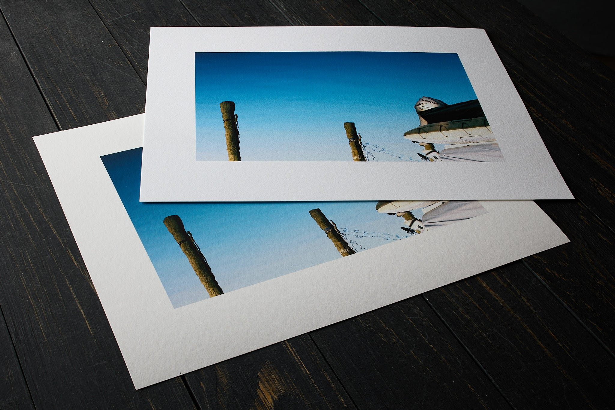
The truth is that the prints looked great, and I was pleased with the vast majority of that work on that paper. The problem was that I did hate how the texture interacted with two or three of the final selections. The commonality of the few photographs that didn’t work was large areas of smooth color with subtle gradients. The personality of the strong texture was too intrusive and completely overwhelmed that smooth gradation, which was most of the photograph.
My reaction to the paper’s personality was entirely based on this particular project. In no way am I implying that large featureless areas in all photographs are a no-go for papers with strong texture. For much work, it can actually look gorgeous and elevate the look. In a lot of cases, the large areas of smooth color or tone can be the reason to use a matte paper with a lot of personality. It just didn’t work for this project and what I wanted it to feel like.
I have a ton of the test prints I made while evaluating my choice of papers for the Watercolors: Subversionproject. As usual, many of those are strewn about my work area. I’ve seen them out of the corner of my eye for the better part of eight months. On dozens of occasions, I’ve picked them up and looked at them more closely. Over the course of time, my position and feelings about some of the prints I initially didn’t like changed. I don’t regret my final choice of ultra-smooth Arches 88 one bit. I still feel that the ultra-textured papers like Museum Etching, Entrada Coldpress, and Arches Aquarelle are way over the top for that project.
What surprises me after a long period of reflection is that my negative reaction to any texture biased my evaluation and caused me to go completely in the opposite direction. The truth is that I could have stuck with the Museum Etching or gone with any of those ultra-textured papers, and the work wouldn’t have suffered as much as I thought it would. Yes, even those few pictures that were suboptimal, the few that caused my negative reaction. How can I feel so differently than I did earlier in my process?
The two factors that changed my mind
Early on, I was intently focused on the two or three pictures that didn’t work well with that original paper choice of Museum Etching. I wasn’t properly looking at a wider view, the collection as a whole. I didn’t consider what I know are contextual factors when evaluating a body of work and how it’s printed and presented.
Factor numero uno: context and sequencing are considerable and are a large part of the decision when presenting work. In this case, I was producing 11-in x 14-in prints contained in a portfolio. I should not and wasn’t planning to use any of those prints as the opening print. The mere sequencing of prints in the portfolio would have provided a context of every print before it having that heavily textured base. The viewer would have been conditioned to the paper’s base texture prior to ever seeing any of the couple of prints where the ultra-textured paper may have been suboptimal. This matters a lot. Sequencing is important for obvious and not-so-obvious reasons. I was ignoring this.
Factor numero deus: context and white space are super important when using ultra-textured papers, especially those bordering on intrusive to the photograph. I’ve discussed [white space]( A Tale Of Three Print Borders …rint with even 2-in borders and a lot of white space. ∙ Feb 10) a lot here on the newsletter; just use the search in our archive. I’m sure buried somewhere in there I mentioned that the more textured the paper, the more important the whitespace in establishing a context of the base of the paper and its relationship to the photograph on that material. I’ll bet that was advice I’ve given dozens of times when using something like Awagami Unryu with giant fibers of mulberry. This is so the viewer intuits what is part of the paper vs. what is part of the image on the paper. I forgot this, or better said, I wasn’t paying attention to it. I was fixated on a single factor on a minority of photographs in the collection.
I could have easily stuck with that original paper. Was it optimal? No. If I had considered it a little longer, I might have gone with Canson Rives BFK Pure White. That would have been an equally valid choice. It would have been perfect and elevated other images in the collection while not having such a strong effect on those few images I thought suffered. It also is the whitest of all the Arches papers, giving the pop I knew I preferred compared to the warmer papers like Entrada Natural.
I don’t regret my choice of Arches 88 in the slightest. In fact, that led me to some experiments that shocked me2 .
Some of you that prefer a super-neutral, super-smooth, and very white base paper, I’d say Arches 88 might be your particular”standard matte paper.”
Note to self: we need a better vocabulary to discuss texture of matte papers to better articulate amount and character of different papers. I’ll work on that. ↩︎
Stay tuned; my shocking experiments are coming soon. Using way out-there media that one might not even think of for some work. ↩︎
I have an additional issue that may be shared by at least a few of your readers. For me, curl is important. I hang a lot of my prints from rails in my atelier. Mostly to compare versions of a image, a task that doesn't last long enough for curl to be a problem. But some number of prints that I like end up hanging there for months. Epson Hot Press Bright/Natural doesn't curl. All baryta papers end up curling, most of them badly enough to be very annoying. Don't know about other papers. So which papers do and don't curl is important to me. Especially since Hot Press Bright has been out of stock so long that I suspect Epson may be discontinuing it. (The 2025 revision of the Epson Media Installer to be much more friendly toward third party papers indeed makes me wonder if Epson is thinking of exiting the fine art paper business entirely.)